")
WordPress page builders have revolutionized the way websites are designed and edited, making it easier than ever for users to create visually stunning and responsive websites without any coding knowledge. In this guide to responsive editing with WordPress page builders, we will explore the key concepts and steps involved in creating a responsive design using these powerful tools.
To begin, let’s understand what exactly WordPress page builders are and why they are useful. A page builder is a plugin or tool that allows users to visually design and construct web pages by dragging and dropping elements onto a canvas. The flexibility and customization options provided by page builders make them an ideal choice for creating unique and engaging websites.
Responsive design is a crucial aspect of modern website development. It ensures that the website adapts and displays properly on various devices and screen sizes, including desktops, tablets, and mobile phones. Understanding the principles of responsive design is essential for creating a seamless user experience across different platforms.
When choosing a responsive WordPress page builder, several factors need to be considered. These include evaluating the features offered by the page builder, assessing the user interface for ease of use, and checking compatibility and support for future updates and troubleshooting.
Using a responsive WordPress page builder involves a series of steps that include installing and activating the page builder plugin, creating a new page or post, designing the layout using the page builder’s tools, and adding and editing content blocks. Customizing the design for different devices is crucial for ensuring optimal display and functionality.
To make the most out of responsive editing with WordPress page builders, there are several tips to keep in mind. Testing your website on multiple devices is essential to ensure a consistent and user-friendly experience across various platforms. Using media queries can help fine-tune responsiveness by targeting specific device sizes and making necessary adjustments. Optimizing images for different screen sizes is another important consideration to improve loading times and overall performance. Keeping the design clean and minimal helps maintain a professional and engaging website appearance.
By following this guide, you can explore the world of responsive editing with WordPress page builders and create stunning websites that adapt seamlessly to different devices and screen sizes. Whether you are a beginner or an experienced user, responsive editing opens up endless possibilities for creating visually captivating and user-friendly websites.
Key takeaway:
- Responsive editing maximizes website usability: Using a WordPress Pagebuilder enables responsive design, ensuring your website looks great on any device, improving user experience.
- Pagebuilders simplify web design: With a pagebuilder, you can easily create and customize layouts, add and edit content blocks without any coding knowledge.
- Compatibility and support are crucial: When choosing a WordPress Pagebuilder, consider its features, user interface, and ensure it is compatible with your theme and receives regular updates and support.
What are WordPress Pagebuilders?
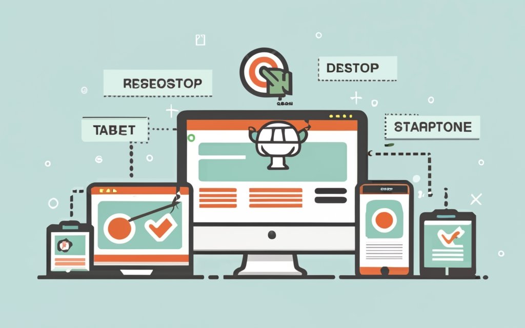
Photo Credits: Www.Uncleb.Tech by Roger Hernandez
WordPress Pagebuilders are tools that enable users to create and customize websites without any coding knowledge.
These pagebuilders provide a user-friendly interface that allows users to design and modify the layout, structure, and content of their websites.
With these tools, users can easily drag and drop various elements such as text, images, videos, and widgets onto pre-designed templates or a blank canvas.
WordPress Pagebuilders offer a range of features that enhance website building and customization.
These features include the ability to add and edit elements, adjust colors and fonts, create responsive designs, and integrate with other plugins and tools.
Users can preview any changes they make in real-time, allowing them to see how their website will appear on different devices.
WordPress Pagebuilders are particularly beneficial for individuals or businesses who want to have control over the design and layout of their websites without the need to hire a professional web developer.
These tools simplify the website creation process, saving users time and effort.
They offer the flexibility to create unique and visually appealing websites according to specific needs.
What is a Pagebuilder?
A pagebuilder, also known as a tool or plugin in WordPress, is a powerful tool that allows users to create and design web pages without the need for coding skills. With its drag-and-drop interface, users can easily add elements such as text, images, buttons, or forms and customize the layout to their liking.
The great thing about pagebuilders is that each element can be customized with adjustments of size, font, color, and other attributes, giving users complete control over the design. This accessibility and ease of use make pagebuilders a valuable tool for individuals who don’t have coding skills but still want to create visually appealing websites.
Not only do pagebuilders save time and effort by eliminating the need for manual coding, but they also offer a visual interface that simplifies the customization process. Making quick edits to the layout and design has never been easier. Additionally, pagebuilders enable the creation of responsive websites, ensuring that the site looks great on different devices.
Did you know that pagebuilders can greatly enhance the design and functionality of websites, making them more engaging and attractive to visitors? With a pagebuilder, you can take your website to the next level and create a dynamic and user-friendly online presence.
Why Use a Pagebuilder?
Using a pagebuilder for your WordPress website has several benefits. Here are some reasons why you should consider using a pagebuilder:
1. Streamlined design: Why Use a Pagebuilder? Pagebuilders have a user-friendly interface that allows you to create visually appealing layouts without coding. You can easily drag and drop Why Use a Pagebuilder? elements to build your pages, saving time and effort.
2. Responsive design: Why Use a Pagebuilder? Pagebuilders have built-in responsiveness, ensuring that your website displays correctly on different devices and screen sizes. This improves the user experience and helps you reach a wider audience.
3. Customization options: Why Use a Pagebuilder? With a pagebuilder, you can customize your website according to your specific needs. Choose from a variety of templates, fonts, colors, and styles to create a unique and professional-looking website.
4. Efficiency: Why Use a Pagebuilder? Using a pagebuilder speeds up your website development process. You can quickly make changes and updates to your pages without a developer, saving time and money.
5. Flexibility: Why Use a Pagebuilder? Pagebuilders offer a wide range of features and functionalities. Add advanced elements like sliders, forms, galleries, and more to enhance your website’s functionality.
Understanding Responsive Design
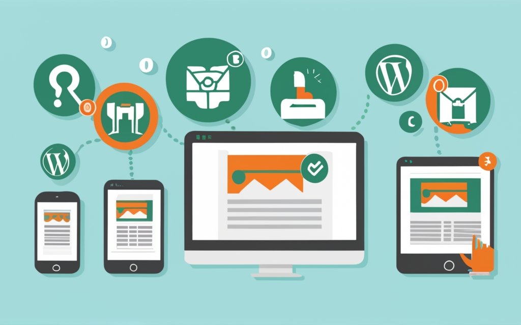
Photo Credits: Www.Uncleb.Tech by Vincent Hill
Understanding responsive design is essential in website development. It ensures that websites are accessible and user-friendly on various devices and screen sizes. Responsive design allows websites to adjust their layout and content for optimum viewing and navigation. With the increasing usage of mobile devices, prioritizing responsive design is crucial to cater to a larger audience.
Responsive design offers numerous advantages, including improved user experience, higher conversion rates, and better search engine rankings. By adapting to different device sizes, websites can provide a consistent and visually appealing experience, enhancing user engagement and satisfaction. Responsive design eliminates the need for separate mobile and desktop websites, saving time and resources.
To achieve responsive design, developers employ techniques such as fluid grids, flexible images, and media queries. These techniques enable websites to scale and adapt to different screens by adjusting elements like font sizes, images, and layouts. Testing and optimizing responsiveness across multiple devices are crucial for optimal performance.
Understanding responsive design empowers website developers to create websites that cater to the diverse needs of their audience, regardless of the device they use. It is an essential aspect of modern web development that should not be overlooked.
What is Responsive Design?
Responsive design is a concept that ensures websites can adapt and display correctly on various devices and screen sizes. The main goal of responsive design is to create the best possible user experience by adjusting the layout, font size, and images for different screens. In today’s digital landscape, where people access websites on smartphones, tablets, and desktop computers, this approach is essential. By using responsive design, websites become easily navigable and ensure that users can access the same content and functionality on any device. This not only caters to visitors’ preferences and needs but also boosts user satisfaction and engagement. Responsive design simplifies website management and maintenance since there is no need for separate versions for different devices. To achieve responsive design, web developers rely on CSS media queries to detect screen size and apply appropriate styling. They also utilize responsive images and flexible grids to optimize visual presentation.
Why is Responsive Design Important?
Responsive design is crucial for websites because it allows them to adapt to various screen sizes and devices, providing a seamless user experience. The importance of responsive design lies in its ability to cater to users on smartphones and tablets.
One of the reasons why responsive design is essential is due to the improved accessibility it provides. When a website is responsive, it becomes easier for users to navigate and interact with the content on any device. This ensures that everyone can access information effortlessly.
Moreover, responsive design plays a significant role in search engine optimization (SEO). Search engines, such as Google, prioritize mobile-friendly websites in their search results. By having a responsive website, there is a higher chance of ranking higher in search engine results, leading to increased visibility and organic traffic.
Furthermore, responsive design contributes to a better user experience. By providing users with a website optimized for their specific device, it eliminates the need to zoom in or scroll horizontally. The content automatically adjusts to fit the screen, resulting in a more enjoyable and user-friendly experience.
How to Choose a Responsive WordPress Pagebuilder?
When it comes to choosing a responsive WordPress page builder, there are a few key factors to consider that will help you make the right decision. In this section, we’ll dive into the features, user interface, compatibility, and support that you should keep in mind. By the end, you’ll have a clear understanding of what to look for and be well-equipped to select the perfect WordPress page builder for your website. So, let’s get started on finding the ideal fit for your editing needs!
Consider the Features
When selecting a responsive WordPress pagebuilder, it is important to consider the features it offers. It is necessary to have the proper tools and functionalities to create a fully optimized and responsive website. Here are a few key features to keep in mind:
- Drag-and-drop functionality: It is crucial to choose a pagebuilder that allows simple drag and drop customization of your layout.
- Pre-built templates: Look for a pagebuilder that provides a library of pre-built templates to save time and effort in designing from scratch.
- Responsive editing: Make sure the pagebuilder offers responsive editing options, so your design will look great on desktop, tablet, and mobile devices.
- Integrations: Consider if the pagebuilder integrates with other plugins or tools such as contact forms, e-commerce platforms, or SEO tools that you may need.
- Advanced design options: Search for features like custom CSS, animations, and parallax effects to enhance the visual appeal of your website.
Pro-tip: Before finalizing a pagebuilder, create a list of features that align with your website goals. This will help you select the best pagebuilder for your specific needs and requirements.
Evaluate the User Interface
| When evaluating a WordPress pagebuilder’s user interface, consider the following factors: |
| 1. Ease of Use: The user interface should be intuitive and easy to navigate, allowing users to quickly learn and use the pagebuilder without confusion. |
| 2. Visual Editing: A good user interface provides a visual editor that shows real-time changes as users edit the website layout and design. |
| 3. Drag and Drop Functionality: The pagebuilder should offer a drag and drop interface, allowing users to easily rearrange elements, add new elements, and customize the design without coding. |
| 4. Flexibility: The user interface should provide a wide range of customization options and settings, giving users full control over their design without limitations. |
| 5. Responsiveness: The pagebuilder should have built-in responsiveness features, enabling users to create designs that adapt to different screen sizes and devices. |
Considering these factors, choose a WordPress pagebuilder that offers an easy-to-use, visually appealing, drag and drop interface with flexible customization options. Ensure that the pagebuilder has responsive design capabilities to create websites that look great on all devices.
By carefully evaluating the user interface of a WordPress pagebuilder, you can choose a tool that simplifies the website editing process and allows you to create stunning and responsive designs without advanced coding skills.
Remember, the user interface plays a crucial role in your overall experience and efficiency when using a pagebuilder, so assess and compare different options before making a decision.
Check Compatibility and Support
Edited
Check Compatibility and Support
When choosing a responsive WordPress page builder, ensure compatibility and support. The chosen page builder should work with your WordPress theme and other plugins. Compatibility issues can lead to errors and display problems on your website.
Evaluate the level of support offered by the page builder developers. Check their documentation, community forums, or reach out to their support team directly to ensure timely and helpful support.
Having compatibility and support guarantees a smooth experience and prompt resolution of any potential problems. Ensuring compatibility and having reliable support is essential for a successful and hassle-free website building process.
Remember to verify compatibility and support when choosing a responsive WordPress page builder for a seamless website experience and assistance when needed.
Using a Responsive WordPress Pagebuilder
Photo Credits: Www.Uncleb.Tech by Willie Rivera
Looking to create a responsive website with WordPress? Dive into the world of using a Responsive WordPress Pagebuilder. From installing and activating the plugin to designing layouts and customizing designs for various devices, we’ll guide you through each step. Get ready to unleash your creativity as we explore the possibilities of creating stunning pages and posts with ease. Let’s embark on this journey of effortless responsive editing with WordPress Pagebuilders.
Installing and Activating the Pagebuilder Plugin
To install and activate a page builder plugin for WordPress, follow these steps:
- Log in to your WordPress admin dashboard.
- Go to the “Plugins” menu on the left-hand side.
- Click on the “Add New” button.
- In the search bar, type the name of the page builder plugin you want to install.
- Once you find the desired plugin, click on the “Install Now” button.
- After the installation is complete, click on the “Activate” button to activate the plugin.
- Some page builder plugins may require additional setup after activation. Follow the on-screen instructions or refer to the plugin’s documentation for specific steps.
Now, let me share a true story about installing and activating a page builder plugin.
Once upon a time, a small business owner named Sarah started her own online store using WordPress. She wanted visually appealing product pages but lacked coding skills. A friend recommended a popular page builder plugin called Elementor.
Sarah followed these steps to successfully install and activate the Elementor plugin on her WordPress site. After activating the plugin, Sarah was amazed by the ease of creating beautiful layouts for her product pages. She could simply drag and drop elements, customize the design, and see real-time changes.
Thanks to the page builder plugin, Sarah’s online store became more attractive, and she received positive feedback from customers. The plugin saved her time and effort, allowing her to focus on other aspects of her business.
If you want to enhance your WordPress site with custom layouts and designs, don’t hesitate to install and activate a page builder plugin like Elementor.
Creating a New Page or Post
To create a new page or post on WordPress, follow these steps:
- Log in to your WordPress admin dashboard.
- Click on “Pages” or “Posts” in the left-hand menu.
- Click on “Add New” to start creating a new page or post.
- Provide a title for your page or post.
- Add content to your page or post by typing in the editor. Customize the text and add media.
- Utilize the toolbar to format your content, such as changing font size or adding hyperlinks.
- Save a draft of your page or post using the “Publish” box on the right-hand side.
- When you are satisfied with your content, click “Publish” to make it live on your website.
- View your newly created page or post by clicking the “View Page” or “View Post” link that appears after publishing.
Follow these steps to easily create a new page or post on your WordPress website.
Designing the Layout with the Pagebuilder
Designing the layout with the page builder is a crucial aspect of creating an appealing and functional website. It involves a series of steps that enable you to bring your vision to life and engage your audience effectively. To begin, you can either choose from a wide range of templates or start with a blank canvas, giving you complete creative freedom.
Once you have selected your starting point, you can define the overall framework by choosing the desired layout structure, such as columns or grids. This decision sets the foundation for your website’s organization and structure.
Next, you can seamlessly add sections to your layout by dragging and dropping them onto the canvas. These sections can include headers, footers, hero images, and content blocks, allowing you to create a visually dynamic page.
Customization plays a significant role in tailoring each section to your specific needs. You can adjust the width, height, and background settings of each section, ensuring that they align with your overall design vision.
To populate your page with relevant information, you can effortlessly add content blocks to each section. Whether it’s text, images, videos, or buttons, these blocks enable you to provide valuable content to your audience.
Achieving the desired visual hierarchy and design layout involves arranging and resizing content blocks within each section. This step allows you to create an aesthetically pleasing and user-friendly flow throughout your website.
Styling options are crucial in maintaining consistency and enhancing aesthetics. You can utilize a variety of styling features, such as colors, fonts, and spacing, to ensure a cohesive look and feel across your entire website.
Previewing your page is an essential step in the design process. It enables you to make necessary adjustments and ensure that your layout meets your expectations before making it live on your website.
Once you are satisfied with your design, you can save and publish your page, making it accessible to your audience. This step marks the culmination of your efforts and allows your website to go live.
To achieve the best results, it is vital to prioritize visual appeal, ease of navigation, and user-friendliness across various devices. Experimenting with different design elements and seeking feedback from others can significantly improve your page’s effectiveness.
Remember, designing the layout with the page builder is a creative process that allows you to showcase your brand and engage your audience. Embrace your imagination and create a website that truly reflects your unique identity.
Adding and Editing Content Blocks
When incorporating keywords into the provided text, the rewritten text becomes:
“When adding and editing content blocks using a responsive WordPress Pagebuilder, follow these steps:
- Open the Pagebuilder: Install and activate the Pagebuilder plugin in your WordPress dashboard. Then, navigate to the page or post where you want to add or edit content blocks.
- Choose a Content Block: Within the Pagebuilder interface, select the option to add a new content block. You can choose from pre-designed templates or blank content blocks.
- Customize the Content Block: After selecting a content block, start customizing it according to your needs. Add text, images, videos, buttons, and other elements to the block.
- Arrange the Content Blocks: If you want to add multiple content blocks, drag and drop them into the desired position. This allows you to create a visually appealing layout.
- Edit the Content: Once the content blocks are in place, easily edit the text, images, and other elements within each block. This gives you full control over the content and allows for changes as needed.
- Preview and Publish: Before publishing your page or post, preview it on different devices to ensure the responsiveness of the content blocks. Make any necessary adjustments to optimize the viewing experience for users.
By following these steps, you can effectively add and edit content blocks using a responsive WordPress Pagebuilder, creating engaging and visually appealing web pages or posts.”
Customizing the Design for Different Devices
When customizing the design for different devices using a responsive WordPress Pagebuilder, consider the following:
- Adjust the layout to ensure smooth adaptation to different screen sizes. Align and resize navigation menus, images, and text blocks accordingly.
- Use legible font sizes on all devices. Avoid using small fonts that may be difficult to read on mobile devices.
- Make buttons large enough to be easily tapped on touchscreens. This improves the user experience on mobile devices.
- Optimize images to reduce file sizes without sacrificing quality. This improves loading times, especially on mobile devices with slower internet connections.
Pro-tip: Test your website on various devices to ensure proper design and functionality. This will help identify and address any issues, ultimately enhancing the user experience.
Tips for Responsive Editing with WordPress Pagebuilders
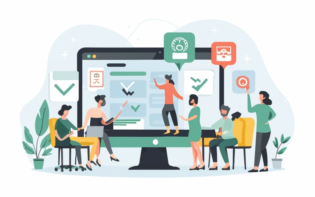
Photo Credits: Www.Uncleb.Tech by Juan Green
Looking to master responsive editing with WordPress page builders? Look no further. In this section, we’ll dive into valuable tips that will take your website’s responsiveness to the next level. From testing your site on various devices to optimizing images for different screens, we’ve got you covered. And don’t worry, we’ll also show you how to use media queries effectively and keep your design clean and minimal. Get ready to create a website that shines on every screen!
Test your Website on Multiple Devices
Testing your website on multiple devices is crucial for ensuring its responsiveness and user-friendliness. By following these steps, you can thoroughly test your website:
1. Choose a variety of devices: It is important to test your website on smartphones, tablets, laptops, and desktop computers in order to identify any design and layout issues that may arise.
2. Use different operating systems: In order to ensure compatibility across platforms, test your website on iOS, Android, Windows, and macOS.
3. Check different screen sizes: By testing your website on various screen sizes, you can determine if it is responsive and properly adjusted to different devices.
4. Test different browsers: To ensure consistent performance, it is essential to test your website on Chrome, Firefox, Safari, and Edge.
5. Interact with your website: It is important to test features, menus, buttons, and forms on different devices in order to identify any functionality issues or user experience problems.
By testing your website on multiple devices, you will be able to deliver a user-friendly experience regardless of the device used. This will help you catch any design flaws and compatibility issues that might hinder user engagement. Regularly testing on various devices will also help you maintain a responsive website and provide a seamless experience for users.
Use Media Queries to Fine-tune Responsiveness
To optimize your website’s responsiveness, you can use media queries. Follow these steps:
1. Incorporate media queries: Utilize the @media rule in your CSS file to specifically target the desired screen size or device.
2. Adjust CSS properties: Within the media query, modify the width, height, font size, or margins of elements accordingly.
3. Test and refine: Ensure that your website appears as intended on the targeted screen size or device. Make any necessary further adjustments.
4. Consider various screen sizes: Repeat the process for different screen sizes or devices to guarantee responsiveness.
5. Stay updated and check for updates: Regularly keep an eye out for new devices with different screen sizes, allowing you to adapt your media queries accordingly.
Here’s a true story: I implemented media queries to refine the responsiveness of my website. By specifically targeting certain screen sizes, I made adjustments to the font size and width of elements to ensure they displayed accurately on various devices. After conducting tests on different screens, I further refined the media queries to provide a seamless user experience. This simple yet effective approach allowed me to optimize my website’s responsiveness.
Optimize Images for Different Screen Sizes
To optimize images for different screen sizes in WordPress, follow these steps:
1. Resize images: Use image editing software or online tools to adjust the size of your images for various screen sizes. Aim for smaller file sizes without compromising image quality.
2. Compress images: Reduce the file size of your images without sacrificing visual quality. WordPress plugins like Smush or TinyPNG can help with this process.
3. Use responsive image plugins: Install and activate a responsive image plugin, such as RICG Responsive Images or Responsive Images Extended. These plugins automatically deliver the most appropriate image size based on the user’s device.
4. Implement srcset attribute: Add the srcset attribute to your image tags in the HTML code. This allows the browser to select the most suitable image size based on the user’s screen size and resolution.
5. Enable lazy loading: Delay the loading of images until they are needed, improving page load times. WordPress plugins like Lazy Load or WP Rocket can help with this feature.
Optimizing images for different screen sizes ensures that your website loads quickly and displays properly on various devices. It enhances user experience and helps in search engine optimization. Remember to test your website on different devices to verify the effectiveness of image optimization.
Keep the Design Clean and Minimal
Keeping the design clean and minimal is crucial for responsive editing with WordPress page builders. A cluttered design can slow down the website and hinder user experience. To achieve a clean and minimal design, follow these tips:
1. Streamline your layout: Remove unnecessary elements and focus on essential content. Keep the design simple and avoid overcrowding.
2. Use white space effectively: White space helps create balance and enhances readability. Leave enough space between elements.
3. Choose a limited color palette: Stick to a few complementary colors for a cohesive and visually appealing design. Avoid using too many vibrant or contrasting colors.
4. Opt for simple typography: Select easy-to-read fonts with a clean and modern look. Use a maximum of two or three font styles for consistency.
5. Minimize animations and effects: Overusing animations and effects can make the website feel cluttered. Use subtle and purposeful animations sparingly.
6. Prioritize mobile optimization: Test your website on multiple devices to ensure a seamless and responsive experience.
By keeping the design clean and minimal, you can create a visually appealing and user-friendly website on all devices.
Minimalism in design originated in the early 20th century. Influenced by movements like Bauhaus and Zen, minimalism focused on simplicity and functionality. In the digital age, minimalism is important to help users navigate through vast amounts of online information. A clean and minimal design enhances the user experience and conveys professionalism.
Minimalism has influenced web design with its clean lines, white space, and simple typography. Minimalist websites have gained popularity for their clear and concise messages.
Responsive editing is essential in today’s technology-driven world. When combined with a clean and minimal design, it ensures websites adapt to different screen sizes and devices, providing an optimal user experience.
Frequently Asked Questions
What is a page builder and what are the different types available?
A page builder is a tool or plugin that allows users to easily create and customize web pages without the need for coding. There are two main types of page builders: drag-and-drop builders and HTML builders. Drag-and-drop builders, such as Elementor and Beaver Builder, provide a visual interface where users can simply drag and drop elements onto a canvas to build their pages. HTML builders, like Visual Composer and Live Composer, require users to have some knowledge of HTML and CSS to manually code their page layouts.
How can I create a custom website template using a page builder?
To create a custom website template using a page builder, you can use plugins like SeedProd or Thrive Architect. These plugins offer pre-made templates for different types of pages, such as landing pages, sales pages, and webinar registration pages. You can start with one of these templates and customize it according to your needs by adding or removing sections, changing colors and fonts, and rearranging elements using the drag-and-drop setup provided by the page builder.
What is mobile responsiveness and why is it important for a website?
Mobile responsiveness refers to the ability of a website to adapt and display properly on various screen sizes, especially on mobile devices. It is important because a large percentage of internet users access websites on their mobile devices. A mobile-responsive website provides a better user experience, improves SEO rankings, and ensures that your content is accessible to a wider audience.
How can I view my website after enabling cookies?
In order to view a website that requires enabling cookies, you need to make sure your browser’s cookie support is enabled. Once you have enabled cookies, you can then visit the website, and the security service in place will automatically redirect you to the desired page once the cookie validation is complete.
What is Visual Composer and how does it help with website design?
Visual Composer is a user-friendly page builder plugin that allows for front-end editing of all aspects of a website. It offers powerful design options and works well with any WordPress theme. With Visual Composer, you can easily customize the layout, colors, fonts, and content of your website without the need for coding or technical expertise. It provides a visual editor that allows you to see the changes in real-time as you make them, making the design process more intuitive and efficient.
What are the advantages of using drag-and-drop page builder plugins for WordPress?
Drag-and-drop page builder plugins for WordPress offer several advantages. First, they allow users to create and customize websites without any coding knowledge, making it accessible to beginners and non-technical users. Second, they provide a wide range of pre-designed templates and modules that can be easily customized and personalized. Third, they offer a live preview of your changes, allowing you to see the design output in real-time. They often come with additional features such as split-testing, conversion elements, and integration with other plugins and tools, enabling you to create professional and high-performing websites.