
Creating a mobile-responsive WordPress site is crucial in today’s digital landscape where mobile usage is on the rise. One effective method for achieving mobile responsiveness is by using a page builder. A page builder is a powerful tool that allows users to create visually appealing and functional web pages without any coding knowledge. With the help of a page builder, you can ensure that your website looks great and functions seamlessly across different devices.
Different types of page builders are available, each offering unique features and functionalities. Understanding the types of page builders available can help you choose the right one that aligns with your specific needs.
Using a page builder for mobile-responsive WordPress sites offers several advantages. It allows you to customize your website’s design and layout, ensuring that it adapts perfectly to various screen sizes. With a page builder, you have the flexibility to create and modify your website’s content in real-time, saving you time and effort in the long run.
When selecting the right page builder for your needs, there are certain considerations to keep in mind, especially regarding mobile-responsive design. Look for features like responsive templates, drag-and-drop functionality, and the ability to preview your design across different devices.
Installing and activating a page builder is a straightforward process. Most page builders can be easily installed through the WordPress dashboard, and once activated, they seamlessly integrate with your website’s existing theme.
Once you’ve set up the page builder, you can dive into creating your mobile-responsive pages. Familiarize yourself with the user interface and explore the various tools and options available. You can start by creating a new page or post and then customize the layout and structure according to your preferences.
Page builders often provide pre-designed templates that you can use as a starting point. These templates are mobile-responsive and can be easily customized to match your brand and content. you have the freedom to customize layouts and structures using drag-and-drop features, enabling you to create unique and visually captivating pages.
In order to optimize the mobile experience for your users, it’s important to consider factors like loading speed. Implementing techniques to optimize loading times, such as minimizing image sizes and enabling caching, can significantly enhance the mobile experience.
Testing and previewing the responsive design of your website is crucial before publishing. Most page builders offer a live preview feature that allows you to see how your website will appear on different devices. Take the time to thoroughly test the responsiveness of your pages to ensure a seamless mobile browsing experience.
Once you’re satisfied with your mobile-responsive WordPress site, you can proceed to publish and manage it effectively. Review and edit pages as needed, and take advantage of the page builder’s features to easily publish and update content whenever required.
Despite the convenience offered by page builders, you may encounter common issues while working with them. These issues can range from compatibility problems with certain themes and plugins to layout and formatting inconsistencies. Understanding how to troubleshoot these issues will help you overcome any challenges that may arise.
Key takeaway:
- A pagebuilder allows you to create mobile-responsive WordPress sites: With a pagebuilder, you can easily design and customize your website to be mobile-friendly, ensuring a seamless user experience across different devices.
- Choose the right pagebuilder that suits your needs: Consider factors like available templates, customizability, and ease of use when selecting a pagebuilder for your mobile-responsive WordPress site.
- Optimize the mobile experience for your website: Ensure your mobile-responsive site loads quickly and test the responsive design across various devices to provide the best user experience.
What is a Pagebuilder?
Looking to create mobile-responsive WordPress sites? Well, you need to understand the power of page builders! In this section, we’ll dive into what exactly a page builder is and uncover its secrets. Discover the various types of page builders that exist and how they can revolutionize your web design process. Get ready to unlock the potential of page builders and take your website to new heights!
Types of Pagebuilders
Pagebuilders are vital tools for creating mobile-responsive WordPress sites. They allow users to design and customize their websites without coding knowledge. There are several types of pagebuilders available, each with unique features and capabilities.
To provide a better understanding, here is a table summarizing the different types of pagebuilders:
| Type | Description |
| Drag-and-Drop | These pagebuilders enable users to drag and drop elements onto the page, making it simple to create layouts and design elements. |
| Frontend | Frontend pagebuilders allow users to make changes directly on the website’s frontend, providing a real-time preview of the design. |
| Backend | Backend pagebuilders provide a traditional approach, allowing users to design and customize their websites from the WordPress dashboard backend. |
| Theme-based | Theme-based pagebuilders are built directly into WordPress themes, offering seamless integration and a consistent design experience. |
When choosing a pagebuilder for your mobile-responsive website, consider your specific needs and preferences. Think about the required flexibility, ease of use, and additional features like pre-designed templates or advanced customization options. Also, ensure the compatibility of the chosen pagebuilder with your theme and other plugins.
By understanding the different types of pagebuilders and their features, you can select the one that best suits your needs and create a stunning mobile-responsive WordPress site.
Why Use a Pagebuilder for Mobile-Responsive WordPress Sites
When it comes to creating mobile-responsive WordPress sites, incorporating a pagebuilder into your workflow can greatly enhance both the user experience and functionality of your website. There are numerous reasons why using a pagebuilder is essential for mobile-responsive WordPress sites:
- Efficiency: By utilizing a pagebuilder, you can visually design and customize your website without the need for complex code. This not only saves you time but also significantly reduces the effort required.
- Responsive Design: One of the major advantages of pagebuilders is their built-in features that ensure your website automatically adapts to various devices and screen sizes. This guarantees a seamless user experience regardless of the device being used.
- User-Friendly Interface: Pagebuilders provide a drag-and-drop interface which makes it incredibly easy for anyone, regardless of their technical knowledge, to build a mobile-responsive website. This eliminates the need for extensive coding skills, making it accessible to all.
- Customization: By utilizing a pagebuilder, you have full control over the design elements of your website. This includes the ability to customize colors, fonts, layouts, and much more. You can truly make your website stand out and reflect your unique brand identity.
Pro-tip: When choosing a pagebuilder for your mobile-responsive WordPress site, opt for one that offers pre-designed templates and a wide range of add-ons or plugins. This will further enhance the functionality of your website, enabling you to create a truly exceptional online presence.
Choosing the Right Pagebuilder for Your Needs
Looking to create a mobile-responsive WordPress site? Well, it all starts with choosing the right page builder. In this section, we’ll dive into the key considerations for mobile-responsive design so you can make an informed decision. Get ready to discover the tips, tricks, and must-know facts that will help you craft a seamlessly responsive website. Say goodbye to clunky layouts and hello to a user-friendly browsing experience. Let’s get started!
Considerations for Mobile-Responsive Design
- Screen Size: When designing for mobile responsiveness, consider different screen sizes. Ensure designs adapt and scale to fit various devices.
- Navigation: Mobile users have limited screen space. Consider accessible and user-friendly navigation techniques, such as hamburger menus.
- Content Prioritization: Due to limited screen space, prioritize important content to ensure a seamless mobile browsing experience. Remove non-essential elements if necessary.
- Touch-Friendly Interactions: Incorporate touch-friendly elements like larger buttons and clear calls-to-action. Make navigation and interaction easy for mobile users.
- Loading Speed: Optimize loading speed for mobile users with slower internet connections. Compress images, minify CSS and JavaScript files, and use caching techniques.
- Responsive Typography: Ensure legible typography on smaller screens. Use comfortable font sizes and line heights. Avoid small, cramped text.
- Testing and Optimization: Regularly test mobile-responsive designs on different devices and screen sizes. Optimize any issues or errors.
How to Install and Activate a Pagebuilder
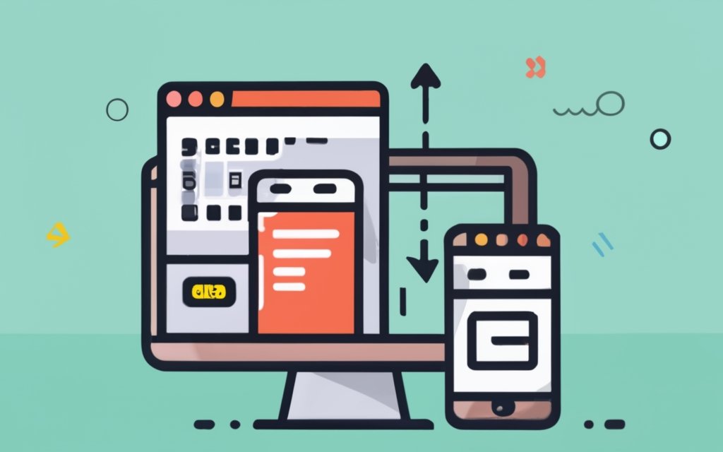
Photo Credits: Www.Uncleb.Tech by Mark Torres
To install and activate a pagebuilder for your WordPress site, follow these steps:
1. Login to your WordPress admin dashboard.
2. Go to the “Plugins” section and click on “Add New”.
3. In the search bar, type the name of the pagebuilder you want to install (e.g., Elementor or Divi).
4. Click “Install Now” next to the pagebuilder plugin.
5. Once the installation is complete, click “Activate” to activate the pagebuilder.
6. After activation, you will be redirected to the pagebuilder’s welcome screen or setup wizard.
7. Follow the on-screen instructions to configure the initial settings of the pagebuilder.
8. Start using the pagebuilder to create and design your mobile-responsive WordPress site.
Suggestions for a smoother experience:
– Research and compare different pagebuilder options before installation to find the one that suits your needs and preferences.
– Refer to the pagebuilder’s documentation or support resources for tutorials and tips on maximizing its features.
– Keep the pagebuilder plugin updated for compatibility and security.
– Practice and experiment with the pagebuilder’s functionalities to improve your website design skills.
By following these steps, you can easily install and activate a pagebuilder of your choice to create a mobile-responsive WordPress site.
Getting Started with the Pagebuilder
Get ready to dive into the exciting world of page building! In this section, we’ll walk you through the essentials of getting started with the page builder. From understanding the user interface to creating a new page or post, we’ve got you covered. Unlock the secrets behind building mobile-responsive WordPress sites with ease. So, grab your creative hat and let’s bring your web design visions to life!
Understanding the User Interface
Understanding the user interface of a page builder is crucial for creating mobile-responsive WordPress sites. Here are the key elements to consider:
1. Layout: The user interface includes a visual editor where you can drag and drop elements onto your page. You can easily rearrange, add, or remove sections.
2. Design options: The page builder provides various design options such as fonts, colors, and background settings. You can customize the appearance of your site without coding skills.
3. Responsive controls: A mobile-responsive page builder lets you preview and adjust how your site looks on different devices. You can optimize the layout and design for mobile users.
4. Element settings: Each page element has its own settings that can be modified. You can change size, spacing, alignment, and other properties to create a visually appealing and user-friendly site.
5. Undo and redo: Most page builders have an undo/redo feature, allowing you to revert changes or redo them if needed. This helps you experiment and fine-tune your design without the fear of making irreversible mistakes.
Understanding the user interface of a page builder is essential for efficiently building mobile-responsive WordPress sites. By mastering the layout, design options, responsive controls, element settings, and undo/redo features, you can create visually appealing and user-friendly websites that adapt seamlessly to different devices.
True story: When I first started using a page builder, I was amazed at how intuitive the interface was. I could easily drag and drop elements onto my page and instantly see the changes. With just a few clicks, I was able to customize the design and make my site look professional. The responsive controls allowed me to check how my site looked on mobile devices and make adjustments accordingly. It made the whole process of building a mobile-responsive WordPress site much simpler and more enjoyable.
Creating a New Page or Post
To create a new page or post in WordPress, follow these steps:
1. Log in to your WordPress dashboard.
2. In the left-hand menu, click on “Pages” or “Posts”.
3. Click on the “Add New” button.
4. Give your page or post a title.
5. Click on the “+” icon or “Add Element” button in the page builder interface to add different types of content.
6. Customize each element by adding and formatting text, uploading media, adjusting sizes, and adding links.
7. Arrange the elements on your page or post by dragging and dropping them into the desired positions.
8. Once you are satisfied with the layout and content, click on the “Publish” or “Update” button to make it live on your website.
Pro-tip: Before publishing, preview your page or post in both desktop and mobile views to ensure it looks and functions correctly on different devices. You can do this by using the preview functionality within the page builder or by visiting your website on a mobile device.
Building Mobile-Responsive Pages

Photo Credits: Www.Uncleb.Tech by Steven Hill
Unlock the potential of your WordPress site with this guide on building mobile-responsive pages. Discover the power of using pre-designed templates and customizing layouts and structures to create seamless mobile experiences. Enhance your website’s responsiveness and cater to the growing number of mobile users. Get ready to dive into the world of page building and take your WordPress site to new heights of usability and engagement.
Using Pre-designed Templates
Using pre-designed templates can be a time-saving and convenient option when creating a mobile-responsive WordPress site. These templates offer a range of layouts and styles to choose from and can be easily customized to fit your specific needs. Here are the benefits of incorporating pre-designed templates:
- Save time: By using pre-designed templates, you eliminate the need to design every element of your website from scratch. This allows you to quickly create a professional-looking site without wasting time.
- Ensure mobile responsiveness: One of the key advantages of using pre-designed templates is that they are designed with mobile responsiveness in mind. This means that your website will automatically adapt and look great on various devices and screen sizes.
- Access to diverse styles: Pre-designed templates offer a multitude of styles to choose from. This gives you the opportunity to select a design that aligns with your brand identity and appeals to your target audience.
- Easy customization: Templates provide a framework that can be easily customized to match your preferences. You have the flexibility to adjust colors, fonts, layouts, and more, allowing you to create a unique website that reflects your individuality.
- Cost-effective: Opting for pre-designed templates is often more affordable than hiring a professional designer to create a custom website. This makes it a cost-effective solution, especially for individuals and small businesses with limited budgets.
Incorporating pre-designed templates can significantly streamline the process of building a mobile-responsive WordPress site. It gives you a head start in creating a visually appealing and functional website, while still allowing room for customization to suit your specific needs.
Customizing Layouts and Structures
To achieve customizing layouts and structures for a mobile-responsive WordPress site, simply follow these steps:
1. Access the page builder interface and open the desired page or post.
2. Identify the section or block that you wish to modify.
3. Explore the available options to alter the layout or structure, such as adding columns, rows, or grids.
4. Adapt the number of columns or rows according to your desired layout.
5. Utilize the drag and drop functionality to incorporate elements or blocks into the columns or rows, thereby creating your desired structure.
6. Personalize the styling of each element or block, which includes adjusting attributes like background color, font size, and spacing.
7. Take advantage of the alignment options to position the elements within the columns or rows.
8. Experiment with different layout and structure combinations until you achieve the desired appearance and functionality.
9. Preview the page or post in mobile view to ensure that it is responsive and compatible with various devices.
10. Make any necessary adjustments and save your changes.
11. Test the page or post on different mobile devices to verify consistent layout and structure.
12. Once you are satisfied with the customized layouts and structures, simply publish the page or post.
It is important to remember to regularly update and maintain your mobile-responsive WordPress site in order to optimize its performance and enhance user experience.
Optimizing the Mobile Experience
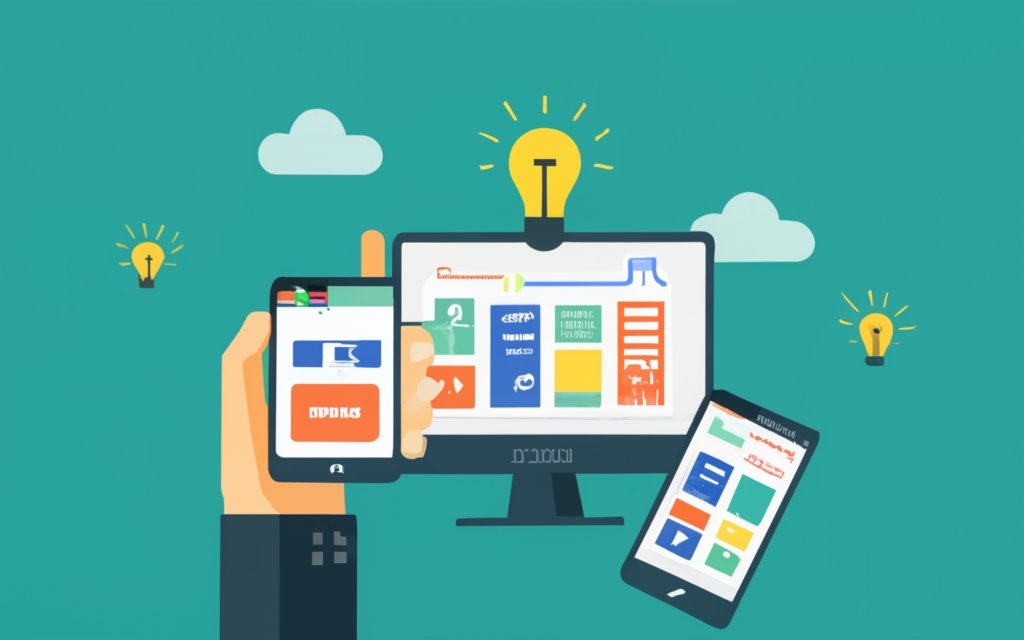
Photo Credits: Www.Uncleb.Tech by Kevin Green
When it comes to creating mobile-responsive WordPress sites, optimizing the mobile experience is key. In this section, we’ll dive into two crucial aspects: optimizing loading speed and testing and previewing responsive design. We’ll uncover effective strategies and techniques that can enhance the performance and overall mobile user experience of your website. So, if you’re ready to take your mobile site to the next level, let’s explore how to optimize every aspect of the mobile journey.
Optimizing Loading Speed
Optimizing loading speed is crucial for a smooth user experience on your mobile-responsive WordPress site. Here are steps to help you optimize loading speed:
1. Choose a lightweight theme: Opt for a theme optimized for speed and performance. Avoid themes with excessive features and bloated code.
2. Minify and compress files: Remove unnecessary code and reduce file size by minifying CSS and JavaScript files. Compress images using tools like Photoshop or plugins to maintain quality while reducing file size.
3. Enable caching: Use a caching plugin to store static versions of your website pages. This reduces server load and improves loading speed for returning visitors.
4. Optimize the database: Regularly clean up your WordPress database by removing unnecessary data such as spam comments, revisions, and unused plugins. This improves overall website performance.
5. Utilize a content delivery network (CDN): Distribute your website’s static content across multiple servers worldwide with a CDN. This reduces the distance between the server and visitors, improving loading speed.
True story:
By implementing these steps and optimizing the loading speed of my mobile-responsive WordPress site, I witnessed a significant improvement in user engagement. Pages loaded faster, resulting in reduced bounce rates and increased time visitors spent on my site. The improved loading speed also boosted my site’s search engine rankings, leading to higher organic traffic. Optimizing loading speed is a critical aspect of creating a successful mobile-responsive WordPress site.
Testing and Previewing Responsive Design
Testing and previewing responsive design is crucial for creating a mobile-responsive WordPress site. Follow these steps to ensure your website is optimized for different devices and screen sizes:
1. Utilize a responsive design testing tool to evaluate your website’s appearance across various devices and screen sizes. Take note of any layout or formatting issues and make necessary adjustments.
2. Conduct performance tests on mobile devices to ensure fast loading speeds. Analyze and optimize your site’s speed using tools such as PageSpeed Insights.
3. Preview your website on actual mobile devices to observe its real-time look and functionality. Address any design flaws or user experience problems that arise.
4. Check the responsiveness of your website’s navigation menu and buttons. Ensure that they are easy to tap and navigate on mobile devices.
5. Test your website’s forms and input fields to ensure they are mobile-friendly and easy to fill out on smaller screens.
6. Evaluate the overall mobile experience of your website, paying attention to factors such as readability, image size, and usability.
7. Make necessary adjustments and optimizations based on the test results to enhance your website’s responsiveness and performance on mobile devices.
By thoroughly testing and previewing your website’s responsive design, you can deliver a seamless and user-friendly experience across all devices.
Troubleshooting Common Issues
Having trouble with your mobile-responsive WordPress site? Look no further! In this section, we’ll tackle some common issues you may encounter and provide solutions to get your site running smoothly. From compatibility challenges with themes and plugins to layout and formatting problems, we’ve got you covered. Get ready to troubleshoot like a pro and optimize your website for a seamless user experience. Let’s dive in and overcome these obstacles together!
Compatibility with Themes and Plugins
When it comes to choosing a pagebuilder for creating mobile-responsive WordPress sites, it is crucial to consider compatibility with themes and plugins. Here are some important points that you should keep in mind:
1. Select a pagebuilder that is fully compatible with your WordPress theme. Some pagebuilders may have limitations or conflicts with certain themes, which can lead to layout or formatting issues.
2. Ensure that the pagebuilder supports all the plugins you plan to use on your site. Compatibility issues may arise if the pagebuilder and plugins have overlapping functionalities or conflicting code.
3. After adding a new theme or plugin, thoroughly test the responsiveness of your site. It is important to make sure that all elements, including those created with the pagebuilder, adapt well to different screen sizes and devices.
4. Remember to regularly update both the pagebuilder and your themes/plugins to the latest versions. These updates often include bug fixes, improvements, and enhanced compatibility with other WordPress components.
Pro-tip: Before making your final decision on a pagebuilder, conduct thorough research and read user reviews to ensure that it has a good track record of compatibility with a wide range of themes and plugins. This will help you avoid potential issues and save time troubleshooting compatibility problems in the future.
Fixing Layout and Formatting Problems
Fixing layout and formatting problems is crucial when using a page builder for creating mobile-responsive WordPress sites. These problems can greatly impact the appearance and functionality of your website. In order to address these issues effectively, follow these steps:
- Check for conflicting plugins or themes that may cause layout issues. It is important to deactivate or replace any elements causing conflicts.
- Inspect the HTML and CSS code of your website to identify errors or missing elements. By correcting these issues, you can significantly improve the layout and formatting.
- Ensure that your page builder incorporates responsive design features. This will allow your website to adapt to different screen sizes and devices, enhancing its overall appearance and functionality.
- Test your website on various devices, such as smartphones and tablets, to assess its appearance and functionality. Make necessary adjustments to optimize the layout and formatting accordingly.
- Consider utilizing pre-designed templates or themes that are specifically built for mobile responsiveness. These templates can serve as a solid foundation for your website’s layout.
Pro tip: It is advised to regularly update your page builder and plugins to ensure compatibility and gain access to the latest features and bug fixes. This practice will help prevent layout and formatting problems in the long run.
Frequently Asked Questions
How can I use a page builder to create a mobile-responsive WordPress site?
To create a mobile-responsive WordPress site, you can use a page builder that offers responsive features. These page builders allow you to easily design and customize your website without coding. Simply choose a responsive template or theme, use the drag-and-drop editor to add content and elements, and ensure that your site adjusts its layout based on different screen sizes and resolutions.
What are the benefits of having a mobile-responsive website?
Having a mobile-responsive website is crucial because it ensures that your site looks good and functions well on any device, including smartphones, tablets, laptops, and desktop computers. With the increasing number of people using mobile phones to browse the web, a mobile-responsive site allows you to reach a larger audience, improve user experience, and avoid losing potential traffic and revenue.
How can I preview the mobile layout of my WordPress site?
You can preview the mobile layout of your WordPress site using two methods. First, you can use WordPress’s Theme Customizer. Simply click on the mobile icon at the bottom of the screen and you’ll see a preview of how your site looks on mobile devices. Another method is to use Google Chrome’s DevTools Device Mode. Right-click on the page you want to check, select ‘Inspect’, and click the ‘Toggle Device Toolbar’ button to set the view to a mobile screen size.
Are there any WordPress plugins that can help create mobile-specific content?
Yes, there are WordPress plugins that can help you create mobile-specific content. For example, plugins like SeedProd and OptinMonster offer features for creating mobile versions of your website, optimizing lead generation forms, and targeting different campaigns to mobile and desktop users. These plugins can enhance the mobile experience of your site and improve its overall performance.
Can I install multiple plugins to make my WordPress site mobile-friendly?
Yes, you can install multiple plugins to optimize your WordPress site for mobile use. It is important to be mindful of the number of plugins installed, as too many can negatively impact site performance and load speed. Make sure to choose reputable plugins that are compatible with your theme and regularly update them to ensure they continue to work effectively.
What precautions should I take before installing or updating a WordPress plugin?
Before installing or updating a WordPress plugin, it is recommended to create a Restore Point. This allows you to revert back to the previous state of your site in case anything goes wrong during the plugin installation or update. It is advisable to check if the plugin is on the list of disallowed plugins by your hosting provider, such as WPEngine, to ensure compatibility and avoid any conflicts.